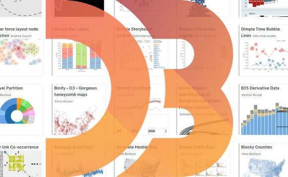
3.js is a well-known JavaScript library, created especially for data visualization. Definitely, the best way of introduction is a demonstration of its possibilities.
Great collections of simple reusable examples, lists of complicated commercial projects, comparatively small personal blogs with surprising experiments. The only principle of this guide is to give a detailed and varied picture of the library. All the resources will be useful for those who are interested in D3.js library learning, or simply want to get an insight about its capabilities.
The official d3js.org gallery consists of various basic charts, maps, animation and other data visualization examples. There are also links on external collections of examples and pages with single charts. Many of them contains an open source code, so it can be used for building a great variety of new visualizations. On the bottom of the page you will find links to useful tools: online editors, libraries, other products.
It doesn’t update often, but still remains the most informative page with D3 examples. If you are interested in D3.js, you really should spend lots of time (hours, days, weeks and maybe months) exploring this page.
12 basic D3.js charts (line chart, discrete bar chart, pie chart etc.) by nvd3.org. All of them have a similar design and colors. NVD3 tries to create reusable D3 charts, that is why these charts are perfect for education. All of them have an open source code.
Great collection of D3 visualizations. Each of the main charts is presented in a several different ways (from 6 to 18 variants). You will find bar charts, pie charts, scatter charts, bubble, area, line, ring charts, step & step area charts here. No maps, but still. Additional 18 advanced examples can be found here, they are combinations of several basic charts.
All examples have the same colors and similar design. A source code can be found on every page of the particular chart.
“Blocks” is a D3 community, run by Mike Bostock, one of the key developers of D3.js library itself. It’s a handy viewer of shared code examples. There are lots of simple visualizations, mostly static. Anyone can join it.
On the homepage there are the latest works. Each one has a title and author’s name. You can click on author’s link and see all his code examples (“blocks”). The most known are, of course, Mike Bostock’s blocks, where you can find hundreds of pieces: maps, graphs, charts, algorithms. It is updated regularly.
Mike Bostock’s publications: visualizations in New York Times and great detailed educational articles. Mostly published in a period of years 2012-2014.
Great gallery of almost 2500 links on large D3.js projects and small examples of visualization, gathered by Christophe Viau. All of them have picture previews. You can easily search by author, chart type or title. The list includes the only one link with year 2015 in a title, so we can assume that it has not been updated regularly during last year. But it remains one of the largest libraries of D3.js visualizations on the web.
You can also watch it as a simple list of links organized in alphabetical order, but It’s hard to search through it (only “Chrl + F”, perhaps). It contains about 1900 links, not 2500.
Christophe Viau personal blog. There are links on his projects created with the help of D3.js library, articles, useful links and information on different visualization tools. Updated regularly.
This collection is named “Over 2000 D3.js Examples and Demos” and it is the best description of the page. A simple list of links in alphabetical order, gathered and published on February, 2014.
A collection of basic charts with a source code. All of them have similar (and a very nice) design and are simple to create and reuse. The project itself was created as an attempt to make d3.js charts without the complexity of d3.js.
Over a dozen of D3 visualizations, created by Nadieh Bremer. They don’t include the source code, but are very interesting to watch. It’s a demonstration of great opportunities, offered by D3.js.
More than one hundred works on information visualization, created by Jason Davies. The collection contains many examples of possible algorithms. Half of works are variations of world maps (all of them can be found on the individual page).
A few dozens of data visualization projects by Jim Vallandingham. They have multivarious forms and data, therefore are pretty much interesting to explore. There is also an “experiments” page with very unusual projects.
Collection of 16 data visualizations on healthcare for 2014-2015 year, prepared by IHME (Institute for Health Metrics and Evaluation). It greatly demonstrates of how clearly large amount of information can be shown for the needs of single field.
Just another blog with a few data visualizations. Over a dozen of D3 projects by Peter Cook. Take a close look on how diverse one event can be visualized – 10 charts for Wimbledon 2013.
The guide doesn’t claim to be complete, of course. If you know great collections of D3 visualizations, haven’t mentioned here, please feel free to email us. Maybe, we’ll gather material for the second part of the guide.


